Insurance Overload | Single/Multi | Author: Conrad Coldwood | Download
Description: The author appeared out of nowhere nearly a decade (!) ago, released two maps and then faded into the woodwork. Of these two maps the more modest one, _balley, seems to often appear on people's "favorite classic type maps" lists. In Insurance Overload Duke explores a city-based EDF headquarters.
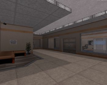
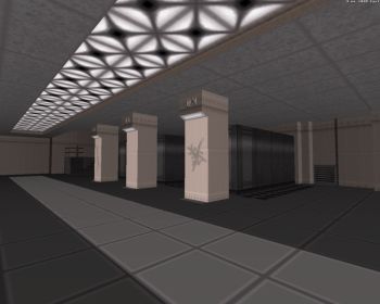
Into It: Like its predecessors, the map plays incredibly well, owing a lot to its 3DR-type interconnected layout with many walls that get blown up, revealing paths to earlier sections. This makes the map flow better as well, as these paths usually work as shortcuts after the player has obtained a key. Unfortunately this type of layout is usually missing from maps as it requires quite a bit of planning in advance, which is something that most mappers (including myself) seem to half-ass. The map's scale is perfect as well, spacious enough to accommodate both smooth navigation and combat, but not too spacious for the given level of detailing. The theme itself felt slightly generic, and the map both looks and plays a lot like Nuked Files from Duke DC. A few new textures have been included and they fit in just well and spice up the looks of the place. When it comes to visuals, the map's texturing is its strongest point. The author's approach to texturing seems at all times to consider the map as a whole rather than a collection of disjoint sections: Variations in texturing are never too abrupt and they tend toward light brown colors most of the time, giving the base a coherent, well-planned look. The map's monster count doesn't present much of a challenge but the layout and the placement of monsters guarantee that you're at all times near the enemy, but never exhausted from combat. At around ten minutes the map is slightly shorter than average (the author seems to have specifically tried to avoid exceeding the old sector/wall limit for whatever reason) and its ending a bit too abrupt but that's forgivable if sequels are on the way.
Conclusion: While the theme is not quite as memorable as that of Needle Time, Insurance Overload improves upon its predecessor's design and layout, giving the map a more, if not perfectly, polished look. Insurance Overload doesn't reinvent the wheel or make your jaw drop at every turn but what it does, it does flawlessly.
Rating: 94


