23rd of October 2018
Note: Do not under any circumstance buy Redneck Rampage or its sequel, Redneck Rampage Rides Again, on Steam. GOG.com is selling the entire package for a $10 base price that's often discounted. I'd also strongly recommend the RedneckGDX source port rather than playing the game in DOSBox.
Redneck Rampage
With games such as Quake 2 and Unreal on the way, those who had licensed the by-then antiquated Build engine for their games must've felt they were racing against the clock. Redneck Rampage's theme, that of fighting hillbillies somewhere in the Deep South, also must have lacked the sex appeal of the three other big Build games (Duke Nukem 3D, Shadow Warrior and Blood). As a kid I only ever got to play the first episode. Compared to Duke Nukem 3D it felt clunky and buggy, and thus I had little interest in acquiring the full game. About ten years ago I played through the base game for the first time, but that did little to change my opinion of it. This time I got the entire package (including the Route 66 mission pack and the Rides Again sequel) when GOG.com was selling it for about 3€ and decided to give Redneck Rampage one last chance.
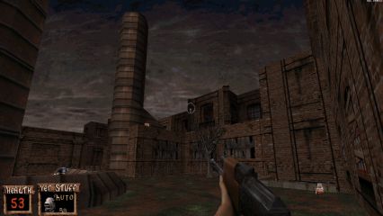
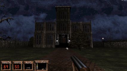
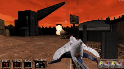
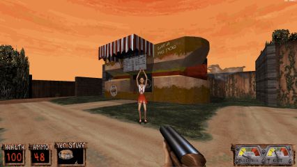
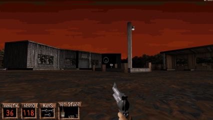
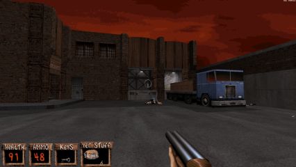
The best thing about the games is its use of the redneck/hillbilly theme. I'd have a hard time coming up with a single level for this theme, but somehow the various developers behind the game and its mission packs have exhausted every redneck theme and setting there is from farms and breweries to bowling alleys and slaughterhouses. I found myself constantly impressed by the game's visuals, owing in no small part to the texturing with its "painted-on" lighting effects that give the impression of the game having true "dynamic" lighting. The skies and backgrounds in this game are great as well, evoking thoughts of "what's behind that treeline over there". Add to this pigs, cows and chickens and a whole bunch of fitting ambient sounds and you'll almost be able to smell the stench of the Mississippi. Maybe you had to have been there in order to be able to appreciate all this, but I found myself constantly hitting the screenshot key.
Unfortunately playing the maps isn't quite so much fun. There are too many things that are easy to miss, keys most of all, being tiny and easily lost in the background. In fact, the way you'll often "find" a key is by suddenly waking up to the fact that it's in your inventory. The keys also all look the same, so you have to go through every locked door one by one; and of course the right one is usually also the furthest. Buttons suffer from the same problem, with there rarely being any indication of what a given button does. (In Duke3D you always knew where to go: the game used signs, cameras or direct lines of sight to guide you in the right direction.) So as you're backtracking to every locked door in the hope of finding the right one, you often find yourself thinking "I have better things to do with my time". And while the maps tend to have decent layouts, a few exceptions were a terrible pain to navigate (The Sewers, The Ruins and the amazingly empty Mansion that for some reason has the honor of being the final map).
As for combat, to describe the gunplay as repetitive would be an understatement. You'll be fighting two hillbilly types (one fat with a shotgun, the other thin with a revolver) for 99% of the game, probably the degenerate results of centuries of inbreeding in the Deep South (or just freshly baked clones straight out of alien gestation chambers...). Another common sight are small alien creatures that can best be described as "Shit Monkeys". While it takes only three revolver shots to rid the world of these annoyances, they are almost impossible to hit when they're on a water sector (which they often are). As for the higher-tier monsters, there's an alien vixen that has invisibility and can obliterate you within a second with her nipple cannons, and a bigger alien creature that poses a bit of a challenge only because it takes so many hits to kill it but is mostly just tedious to fight against. At least there are some beefy guns in your arsenal; even the revolver remains an effective tool throughout the game due to its hitscan accuracy, but I could never get used to the inconsistent shotgun.
Conclusion: If you're into Build-engine games, Redneck Rampage is ultimately worth a try if really for no other reason but to see the maps. Just be warned that they're a bit of a bore to actually play through.


Suckin' Grits on Route 66
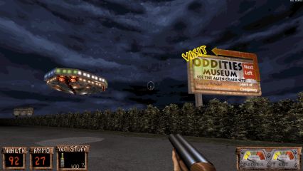
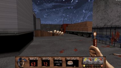
Suckin' Grits on Route 66 represents the worst of the late '90s "mission pack" design. While these days entitled millennials like to complain about 5-hour DLCs being "too short" in relation to their lousy price tags ($10-20), back in the day you had to spend the equivalent of $50 in today's money on 2 hours' worth of content that could best be described as "more of the same". Aside from an irrelevant crocodile (or is it an alligator?), Route 66 offers no new monsters, no new guns, and as a final insult even the final boss is exactly the same (Xatrix, the creators of the base game, did the exact same thing with their The Reckoning mission pack for Quake 2). There are some good maps among the 12 or so in the pack, but a few of them (especially the Big Foot Convention Center) have no place in a commercial product. While the first episode is still mostly on the good side of things, consistency seems to fall off a cliff in the second episode, probably a result of having a relatively large team of mappers (including some Duke3D usermap veterans) working on a small amount of maps.


Redneck Rampage Rides Again
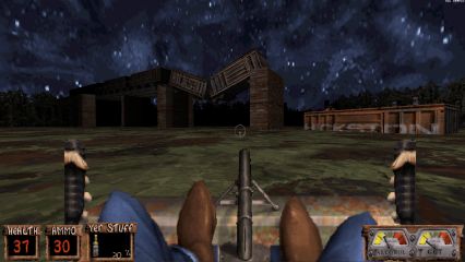
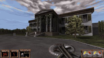
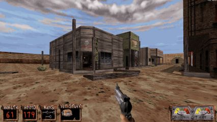
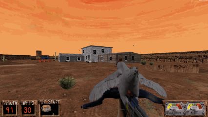
Unlike the Route 66 mission pack, Redneck Rampage Rides Again was marketed as a proper sequel (despite sharing the same engine; think of Doom 2). The setting has changed further west with its canyons and wide-open terrain, but shifts toward more familiar grounds in the second episode as Leonard and Bubba make their way back home. Around half of the maps feature one of the two vehicles in the sequel; the airboat or the motorbike. Not only are their controls surprisingly fluid but they also breathe some much-needed variety into the game's rusty mechanics. There is a logical progression to the maps (and the end-of-level stats screen shows this progress on a map like in the first Doom), making the sequel's two episodes feel like a journey with a purpose rather than just a mishmash of maps that happen to share a common theme.
That being said, many of the maps are still plagued by their over-reliance on keys, buttons and constant interruptions on the game's flow (and the sequel does nothing to fix bugs inherited from the base game, such as the wonky hitreg). But at least there are some real gems this time around, with Refinery being the best example. Its beating and clanking machinery, rich ambient sounds and atmospheric lighting make for a wonderful setting, while its linear-but-interconnected layout helps maintain a constant flow; the player finds himself making progress rather than just aimlessly bouncing around. In general the maps are a marked improvement over the base game and the expansion, offering better user of their themes, more freedom of movement and some much-needed variety. Combat is still mostly the same, but at least there are three new enemies this time around that are used often enough to break the tedium of fighting the same two hillbillies all the time.
Conclusion: Rides Again doesn't change the fundamentals of the base game but rather expectedly inherits its many flaws. However, there are enough marked improvements in terms of map design and overall gameplay that justify a better rating.


