|
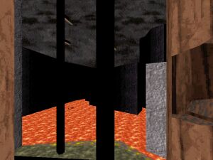
Gray Hill | Single | Author: Zaxtor | Download 46kt Although 'Gray Hill' has its major flaws it still was very near to reach the section of uberlevels. Its design is at times interesting, detailed, empty and annoying. Gray Hill seems to be divided in three sections - Mountains (snow or rock? Don't ask me), a forest (very good looking with some annoying issues) and some facility. Areas inside the facility are a bit so-so. One hallway looks very good and there are some nice design ideas. However one hallway & one room were very empty. There was also this interesting and innovative puzzle - You have to use some monitor to see your path but unfortunately this area seems to be very buggy (dnclip if you wish). Some buttons are poorly placed - They're just forced to snowy (rocky?) walls or trees which doesn't look very good. The forest looks very good but comes with the most annoying jump puzzles which gave me a headache. Then there was this one strange red mountain (quite similar to that one in Final Doom) which looked good but could have been used more often (by cutting some walls to make it more visible). There was a ship in the beginning which dropped you down to your mission and it looked nice. Gray Hill surprised me with its interesting design and areas but that forest jump puzzle is not designed for those who have no patience. Also for some strange reason the screen turned to palette 6 a couple of times. |

|
 |
Best Maps: | Latest Maps:
E-I-E-I-D'oh |
