Hollywood Holocaust Rethinked | Single | Author: Team Misfit | ModDB
The Review: More than 20 years since the release of Duke3D, the game's first map, Hollywood Holocaust, has been given the next-gen
treatment. This Polymerized version features everything from 3D models to cutscenes. Overall, the differences are mostly
audiovisual; the map's layout is pretty much the same, although with the addition of a few brand new areas to make the
map a bit more interesting for those who've already played the original to death. Purely in terms of graphical fidelity the
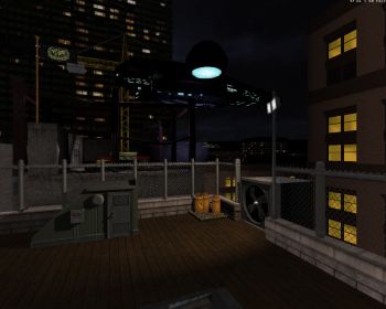
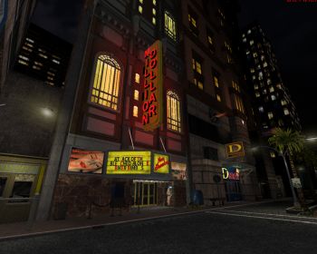
map looks better than Duke Nukem Forever (which admittedly looked dated upon release): the main street area is teeming with interesting details, the theater is unexpectedly glossy from the inside and there are voluptuous women everywhere. Moreover, the implementation of Polymer lights as a replacement for sector-based lighting is perfect. Overall the map's presentation is ambitious, and there
are many jokes any true fan will appreciate, not to mention a cool little surprise at the end. But the project comes off as a bit clunky and unpolished. Two music
tracks seem to be playing during the title sequences. The streets are filled with civilians, but they're motionless and seemingly
oblivious to the ongoing carnage. The new enemy models look great, but their animations are a bit wonky, as if not
sitting well with the old AI code. It also often feels like you don't have enough space to move around, perhaps a combination
of Duke's running speed and the addition of many 3D models as decorations within the confines of the old layout.
For a Polymer project the map's performance isn't too bad once you take the resolution down. For most of the map the framerate is about playable (20-30 in the main street area, 30-50 inside the theater),
but I came across nasty spikes on several occasions, the effect of which is exacerbated by the fact that sometimes you end up in
the way of projectiles during these spikes. Also, the obvious downside to playing on a lower resolution is that the graphics lose
a lot of their sharpness so that you're not really getting the full next-gen treatment you were expecting.
Conclusion: The team behind the map has done a great job with all the new assets and making the map look modern in every respect, but there's just something a bit off about combining all this with the old code and gameplay elements. Moreover, more liberties could have been taken with the placement of monsters to ensure the map isn't as boring challenge-wise as playing Hollywood Holocaust for the millionth time.
Rating: No rating


