Day of Night | Single | Author: DannyFromNewOrleans | Download
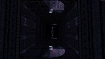
The Review: Duke is stuck in what appears to be a neverending sewer system. And "stuck" is exactly
how you'll feel most of the time playing this map. There are only a few maps that compete
with Day of Night in being as extremely cramped. The author may have gone for realism in
terms of scale, but that's a very poor fit for a Duke3D map considering the game's speed
and hitscan enemies. Things do get a little bit better in the last third of the map, but
crampedness never really stops being a nagging problem. Add to that the fact that the map
is filled with enemies, including lots of Commanders, and irritation starts to sink in quite fast.
Respawns should also be used more sparingly; since Wolf3D an important element in shooters has
been the feeling of satisfaction derived from having completely cleared an area off enemies, but an
excessive reliance on respawns hinders this and frustrates the player.
A factor contributing to the map's claustrophobia is the constantly low brightness level. If you don't get a lot of space
to move around, you should at least be able to see where you're going and where the enemies are.
(Admittedly the high brightness level in my apartment isn't helping either,
but we don't get a lot of darkness at this time of year, and I don't really have many
opportunities to play in the middle of the night.) As if this wasn't enough, some
Enforcers are semi-transparent. But hey, unlike in the vast majority of maps, you should at
least find night-vision goggles useful.
The map's puzzles involve lots of buttons and locked doors, but there are a few that veer toward
the too-clever-by-half pitfall.
Examples of these include one involving prime numbers (simple enough for me, but the vast majority will have to rely on google),
another a six-button puzzle with a lousy hint I realized only after having checked the solution
in Build, and then there's an underwater corridor where you have to navigate through
tripmines while trying to preserve oxygen.
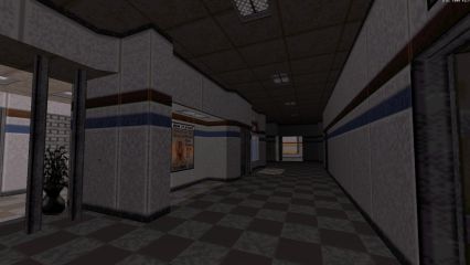
So why is this a Hot Map then, even if just barely? Well, the map does look good. The sewer segment is a little
bit dull even if well designed (good texturing and lighting but very generic), but the rest
of the map looks increasingly interesting and polished with some nifty texturing. Getting out
of the sewer and into the streets feels like an achievement in itself. But even here the map's
shortcomings are all too obvious. For example, why does the street area have to be so devoid of lights?
Conclusion: The author knows what it takes to build a good looking map, but it won't do if the scale is not conducive to gunplay: a large number of monsters requires plenty of space for the player to move around. Also, beta testing should help iron out any annoyances related to puzzles. I'd love to see more maps from the author; a lot of the design in this map is quite pleasing to the eye, and getting the scale right is usually nothing more difficult than getting the scale of the very first room right.
Rating: 85


