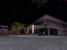
Libraryl | Single/Multi | Author: Michael "Micky C" Crisp | Download 1.7Mb
Micky C's prevous map, Action Time on 7, relied too heavily on Polymer lighting without paying much attention to either consistency or detailing. Libraryl is more consistent but doesn't improve much in the design department.
The map was designed with dynamic lighting (Polymer) in mind. Unfortunately, even with my brand new computer the outdoor area gives me less than 10 fps at all times even at a low 1024x768 resolution (!!!). This effectively renders the map totally unplayable the way it was meant to be played. There is some sector-based lighting to compensate for this and it's not bad at all. Some wall-based sloped lighting has been poorly implemented but if you're not a mapper yourself you probably won't notice this.
Not much attention has been paid to detailing and architecture is very blocky. For example, the area that surrounds the school consists of nothing but square buildings and canyons with absolute no details of any kind. Like in Action Time, some areas manage to stand out (the front of the school building) but these moments are fleeting. There's an odd, steeply sloped road that leads to the school, a location that seems rather surreal. In general, the outdoor area suffers from being too big and as such time-consuming to handle in terms of detailing. There are some cool ideas such as a teachers' lounge filled with porn magazines, cigarettes and beer and a shooting range in the school's basement.
The map is advertised as nonlinear but actually there's just one way to reach a given location and the nonlinearity comes from the few extra rooms you can, but don't have to, visit. This isn't really a bad thing although it does lower the replay value of the map. Nevertheless the map plays well with a good item/monster ratio and the inconsistency that somewhat bothered Micky C's previous map is absent.
In conclusion, it seems that designing mediocre usermaps with Polymer in mind is a deadend. As it is, Polymer is unplayable so you shouldn't count on it to provide pretty visuals. The biggest problems with this map are the lack of details and the oversized outdoor area (all the way from the beginning to the school building), which obviously contributes to the lack of details. The map is fun to play and has a few good ideas but these days you tend to expect more from a Duke3D level.
Rating: 74


