LOST | Single/DM | Author: Ten of Swords | Download
Description: Here it is, the first Duke3D map based on the tv series Lost (which I loved, except for the finale that didn't really explain anything and went utterly soft in one of its dream scenes). The map is medium size and you get to visit several locations from the series.
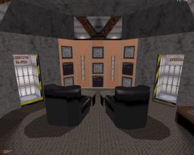
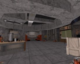
Into it: Fans of the show should expect to get the most out of the map, picking up familiar locations as they play, but there's plenty of eye candy for the rest of you as well. The locations not only look like their Lost counterparts but they capture their feel as well. There's lots of 1970s type of equipment such as big computers and some of the indoor architecture vaguely reminded of Billy Boy's maps, although this map's scale is much smaller, even to the point that its outdoor locations felt a bit too restricted. Luckily the few outdoor locations serve only as short introductions to the concrete stations that follow. Two more points are worth noting: texturing and lighting. It's no wonder that Duke's exceptionally comprehensive texture set has tons of material that fits the theme. Lighting in turn relies on sharp contrasts between dark and bright areas and as such is akin to 3DR maps.
Three DHARMA Initiative stations make an appearance: the Swan, the Looking Glass and the Orchid. Traveling is conducted via teleports, which may seem a bit off but is not so bad as it'd be nearly impossible to link the stations in any other sort of credible way considering the supposedly long distances between them. However, the map would have been more interesting with a storyline, something that would have provided a rationale for going from one station to another. Now the presentation is more along the lines of "Here's a collection of three locations from Lost, filled with some monsters". I wouldn't have minded seeing some text messages displayed on viewscreens, for example, maybe signed by DHARMA employees or some of the characters. This would have brought the environment a bit more alive. Also, a map like this basically screams for some custom material, in this case sound clips from the series. For example, I'd have loved to hear the Swan station alarm go off (along with the female voice repeating "system failure") near the end. Or what about starting the map with the player drifting toward the title "Lost" (with that eery sound in the background), like in the series?
Conclusion: Lost, the map, is one of the most pleasant surprises in a long time. It manages to capture the looks and feeling of the series although these could've been enhanced even further. Fans of the show will love it but non-fans should enjoy it too, especially since they're probably unable to notice that the theme is not exploited quite as fully as it could have been.
Rating: 93


